A mock up for what the food packaging at Underground Burger’s would look like. The colour of the packaging is determined by the name of the burger and its corresponding London Underground Line. The mock up was created using Adobe Photoshop.
Underground Burgers
Concept Creation/ Brand Identity/ Menu Design
‘Underground Burgers’ is a concept for a restaurant that I came up with in 2020.
The concept is for a burger restaurant where the interiors, graphics and overall branding is inspired by the London Underground.
The project initially came to mind when I encountered the TFL’s (Transport for London’s) moquette used on the seats of their transport in the Transport Museum’s gift shop. In their pristine, unused form they look beautiful (as opposed to their grubby appearance on public transport).
On the same day I went to a ‘Five Guys’ for lunch and wondered what a London Underground themed burger restaurant could look like (with the moquette fabric used for the upholstery).
The project includes an exploration of graphic design and packaging design and using my past experience as a chef I decided to also come up with the menu, trying to be considerate to dietary requirements such as vegetarian, gluten free, dairy free etc. to create a menu that would be easy to cater to anyone and also delicious!

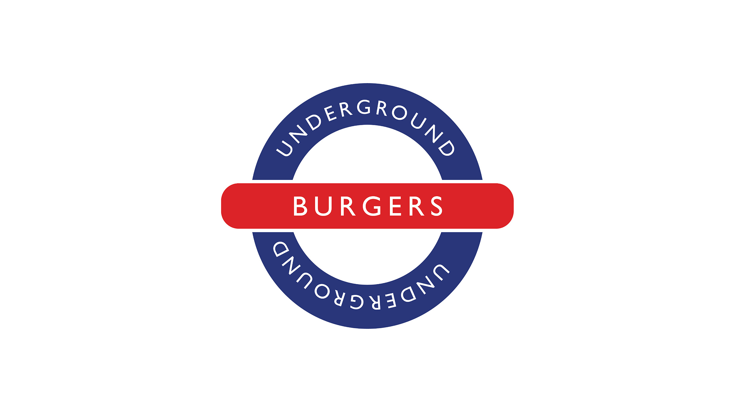
The Logo for Underground Burgers is based off of the London Underground’s logo but with a few differences. The most obvious being the colours have been inverted. The logo was created in Adobe Illustrator.


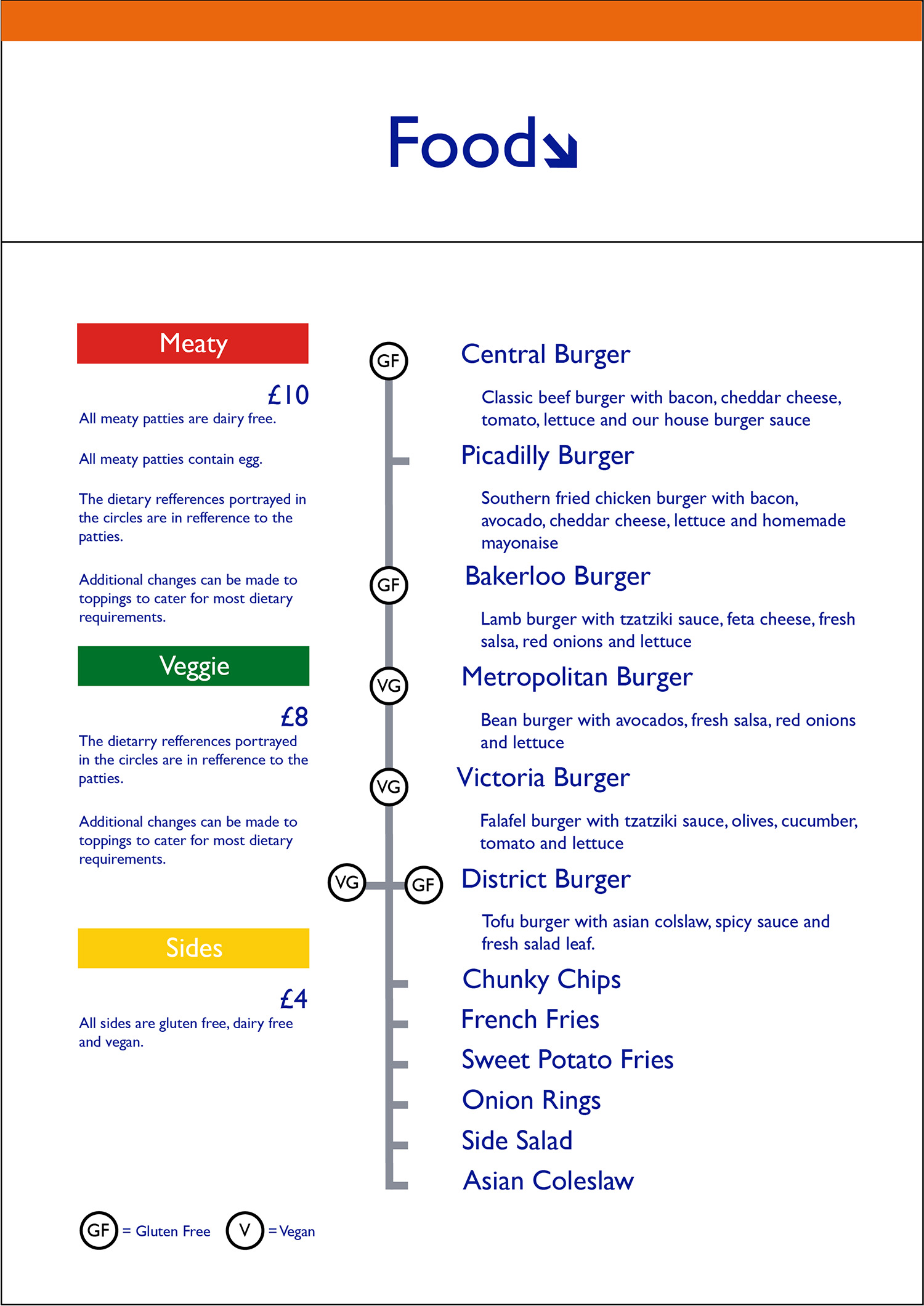
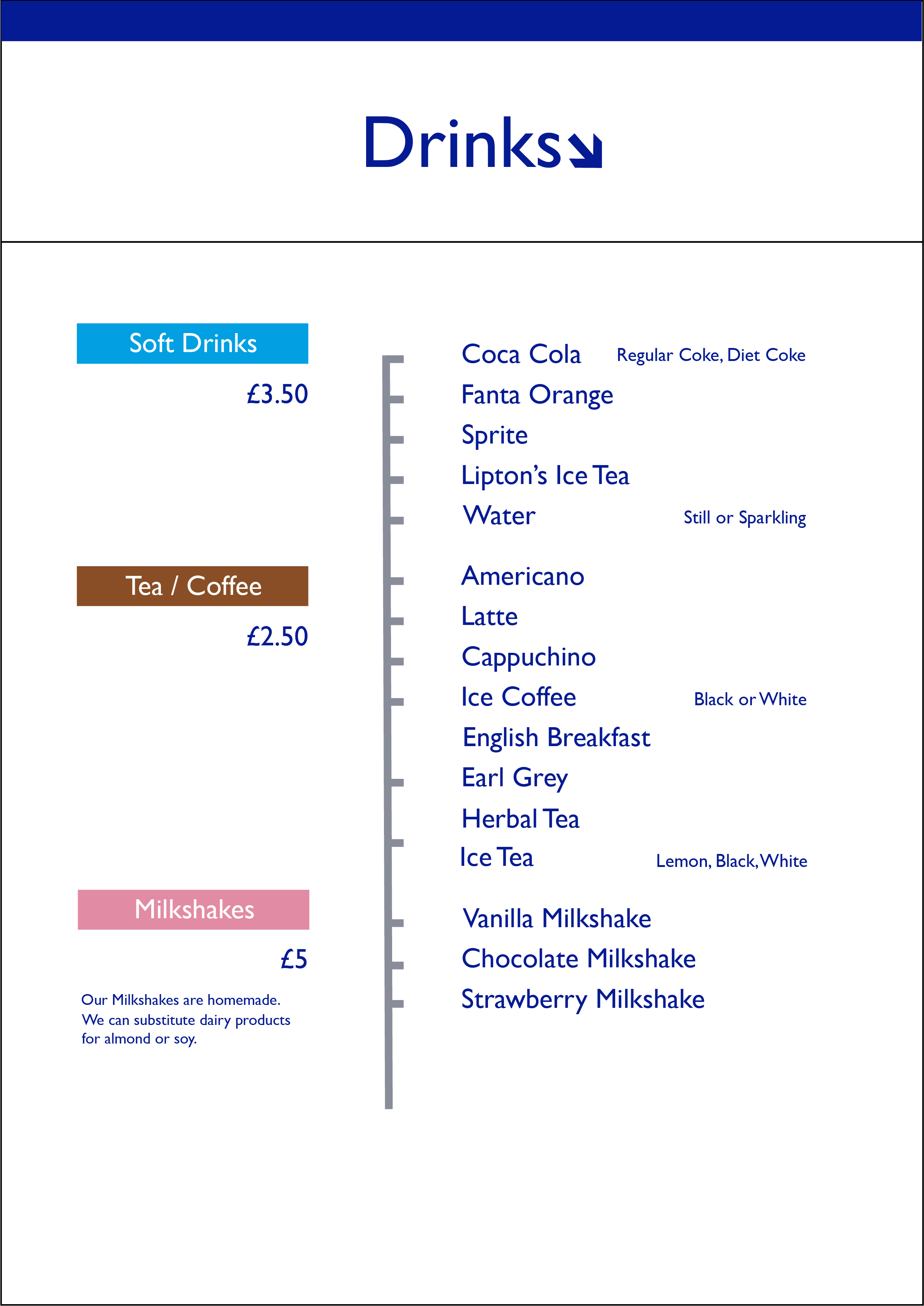
The menus are inspired by the line maps in the London Underground. Using my background experience as a chef I also designed the menu itself to try and create a menu that would be delicious for all kinds of eaters!
