
London Parkive
Data Collection & Management/ Digital Product Design/ Web Development/ Data Visualisation
The London Parkive is an interactive map documenting the history and evolution of London's parks and open spaces, created as my final year project at university.
What sets the Parkive apart:
1. It traces the geographical changes of parks, including expansions, reductions, and lost or inaccessible spaces.
2. It highlights parks at risk of development due to reduced protections, budget cuts, and increasing urban demands.
Explore the accompanying Context Report (Dissertation) here!
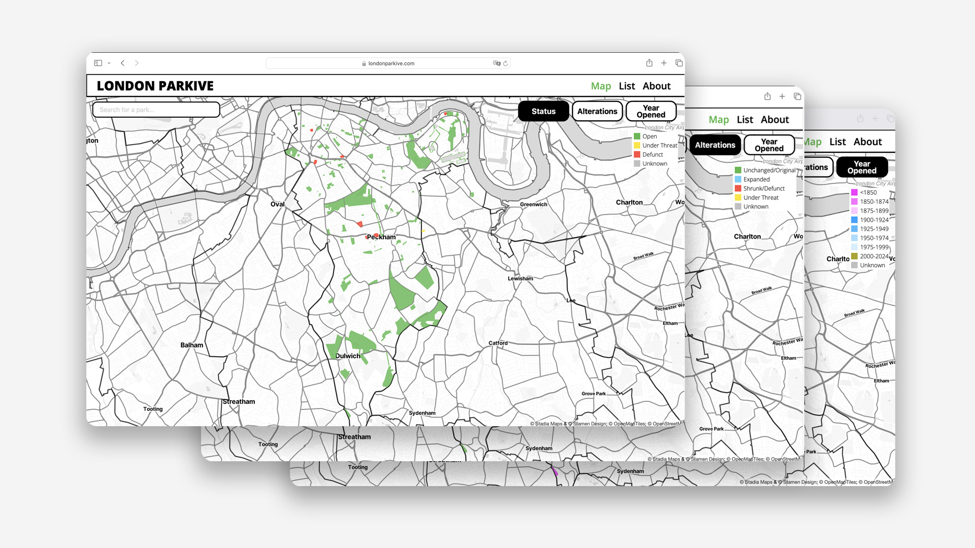
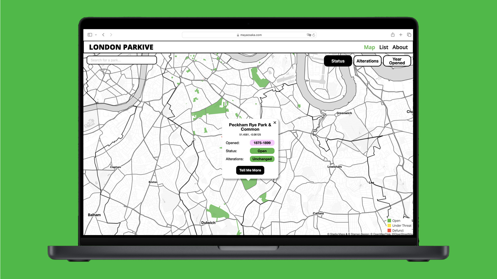
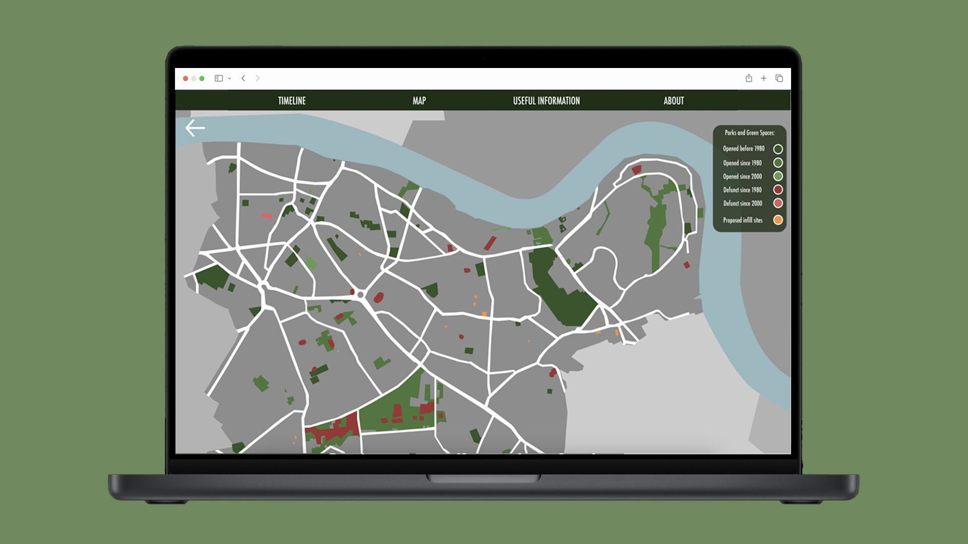
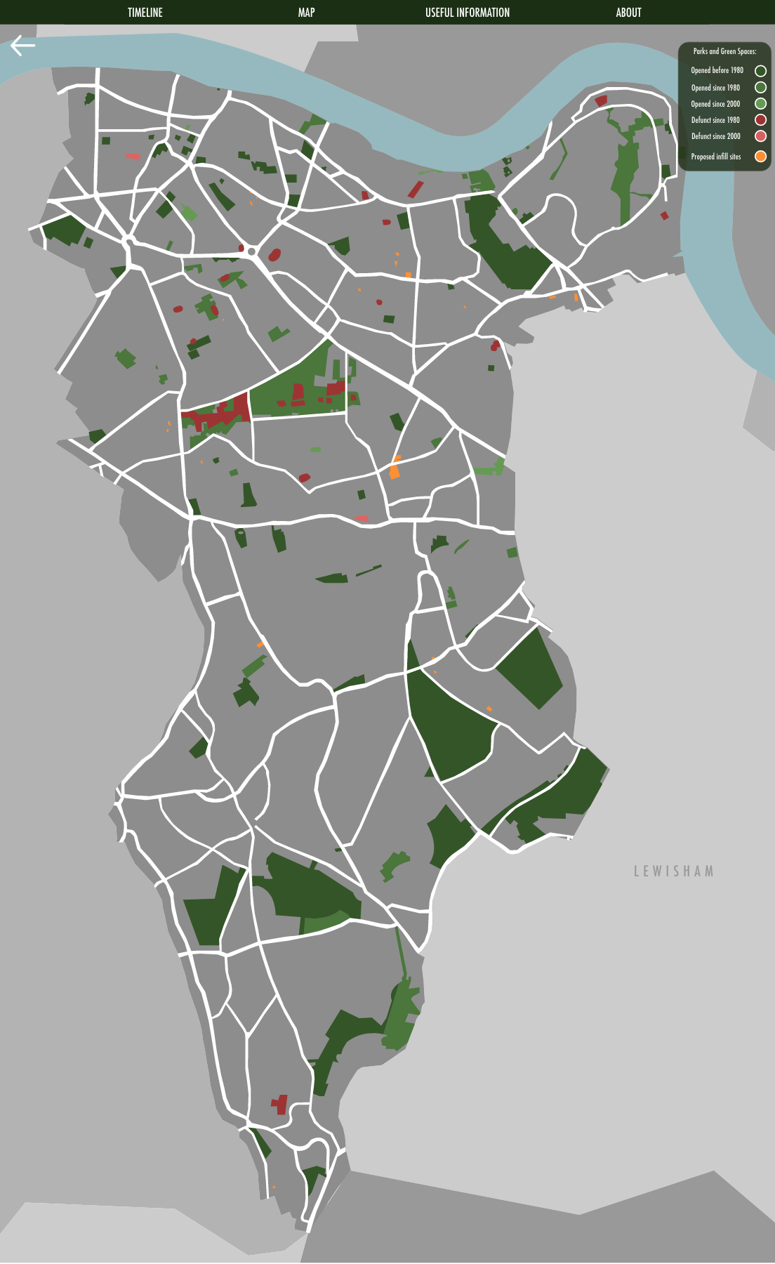
There are three different view modes on the London Parkive which lets you see different colour coded data.
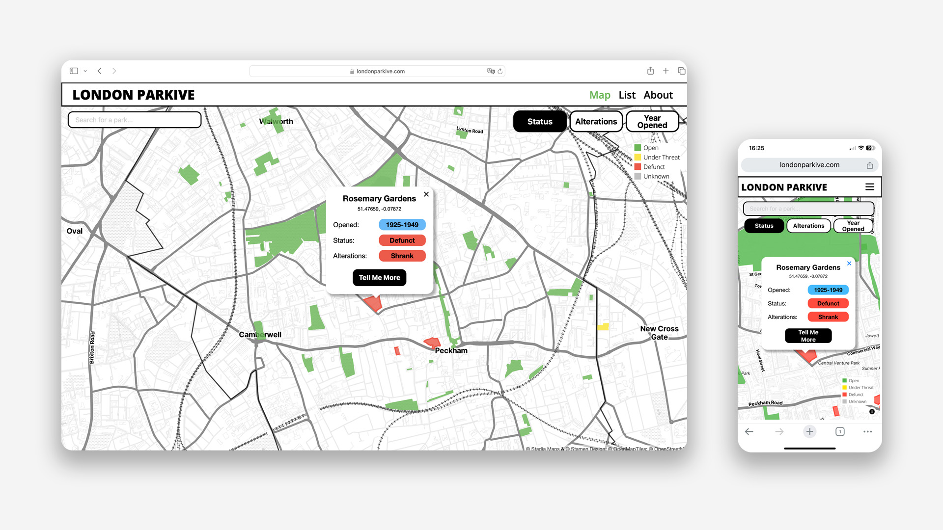
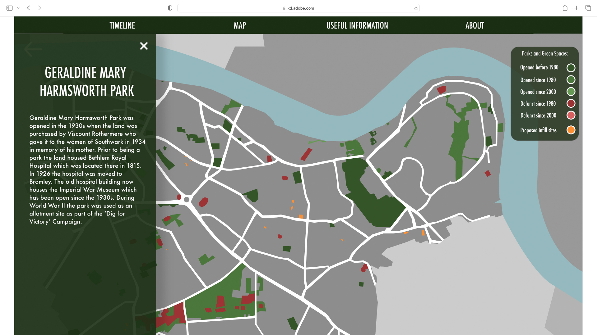
If you click on a park a popup with a summary of the park's information pops up.
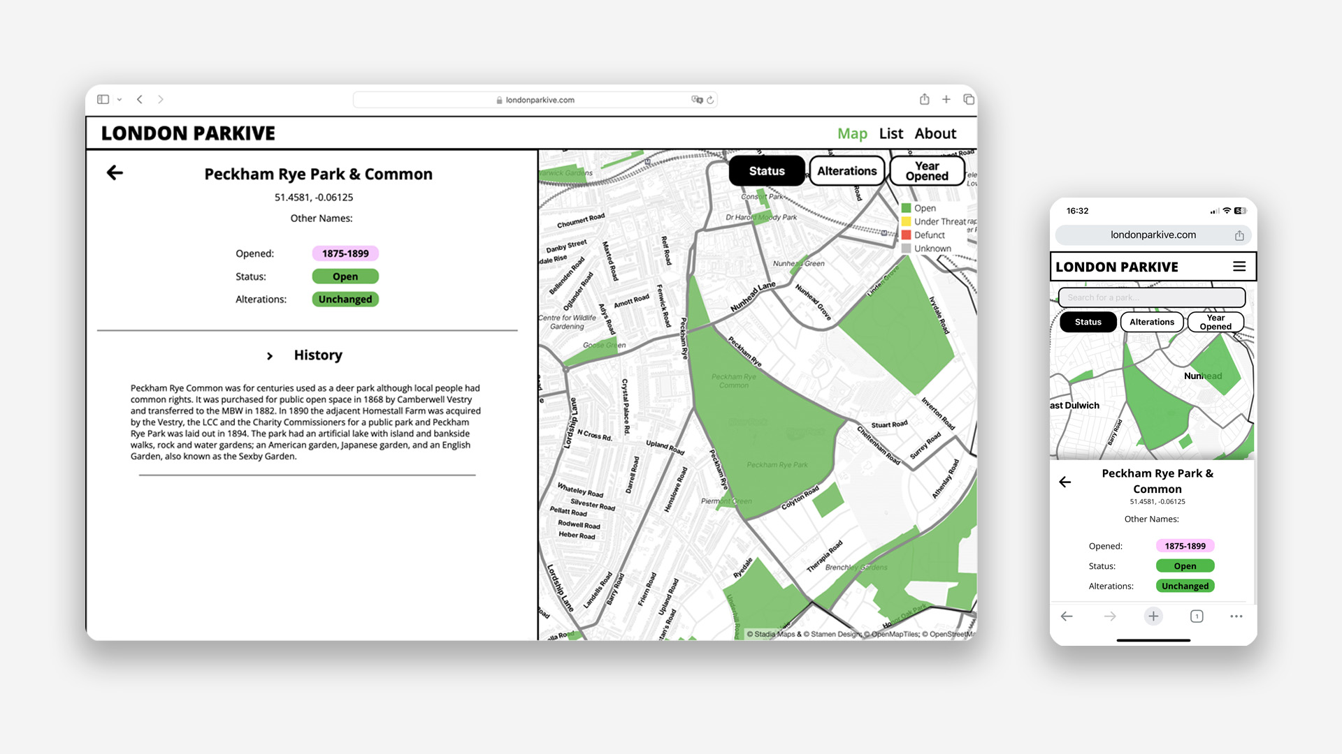
The "Tell Me More" button opens an overlay with more information on the park.
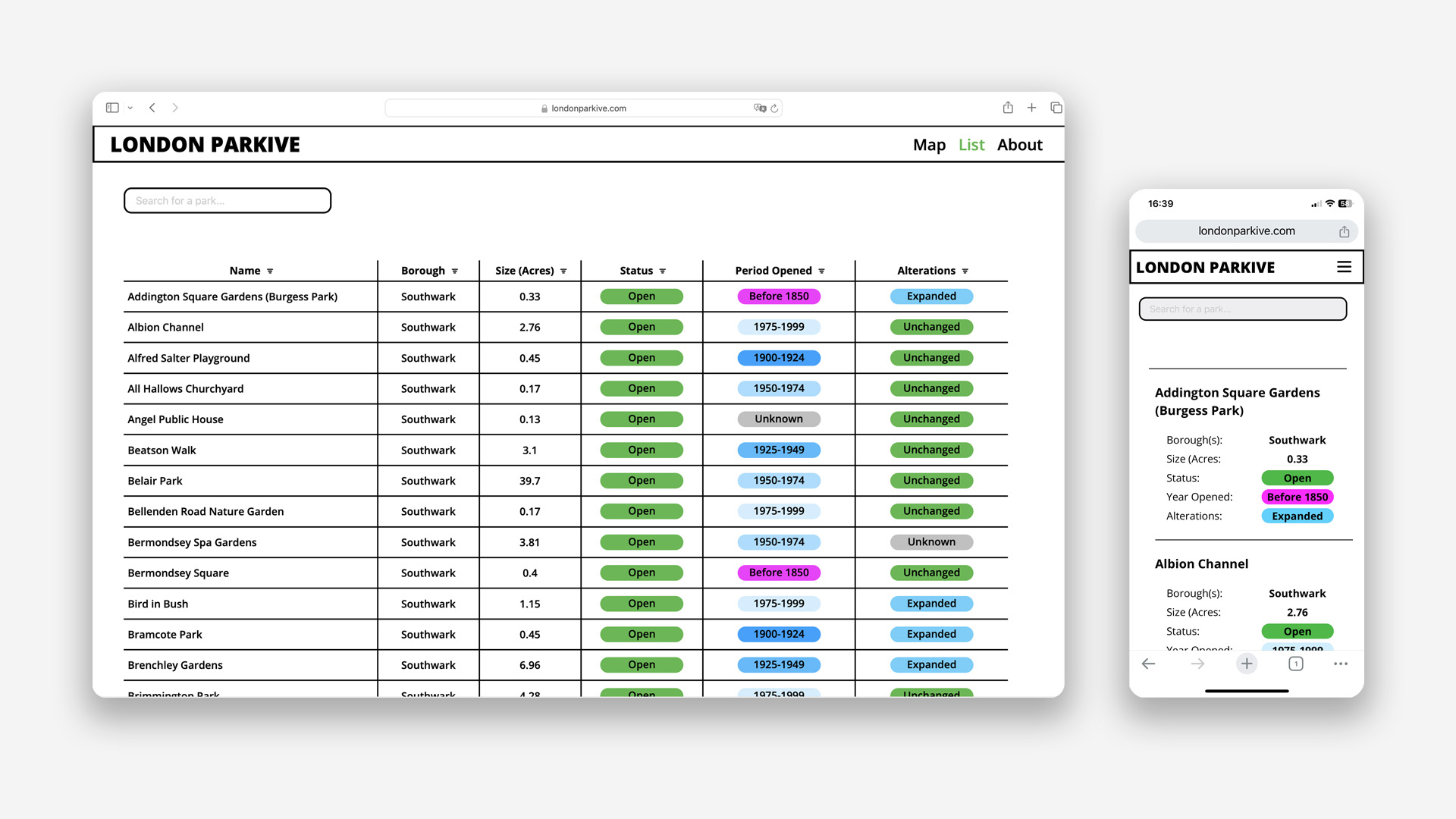
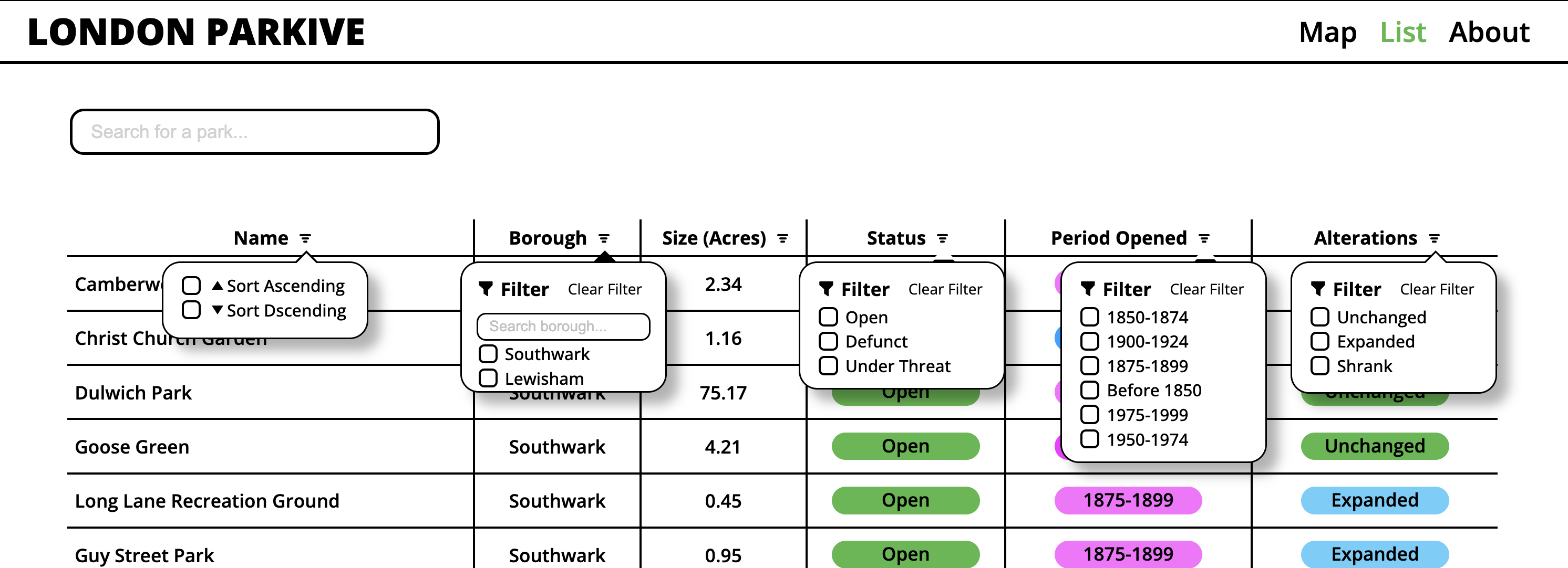
The list view lets you view the same information in a table format where you can filter the parks based on different information.
The London Parkive is my final year project at university but the origins for the project started two years ago during my first year final project…
London Parkive V1
Mock up of the original London Parkive I created during my first year of uni. The original London Parkive was an Adobe XD mock up of a website.
The London Parkive V1 was created during my first year final project over a six week period. The idea for the Parkive came about after I visited a park in Lewisham called Charlotte Turner Gardens which at the time was under threat from development. This lead to two questions:
How many parks in London are currently under threat from development?
How many parks are no longer with us and where were they located?
After scouring through the internet I found that there was no clear answer and no consolidated information that would make it easy to answer these questions and so the concept for the London Parkive was born.
Screenshot of the map I made for the original London Parkive. Rather than use an existing base map I decided to illustrate my own using Adobe Illustrator.
At the time I had just found out about prototyping software such as Figma and Adobe XD and was eager to give web prototyping a go. So the project took the form of an Adobe XD web prototype which you can view here! With it being my first time prototyping, I was still a long way off thinking about usability and core principles of UX design BUT I became pretty good at using Adobe XD.
Screenshot from the original London Parkive depicting information on a park that has been clicked on.
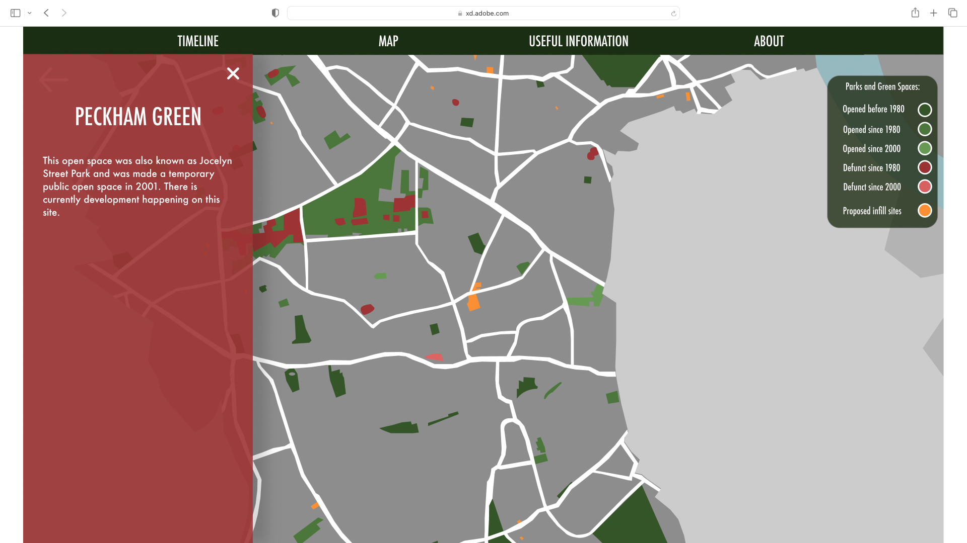
Screenshot from the original London Parkive depicting information on a park that no longer exists anymore.
Researching parks and open spaces also took up a large chunk of the project. Like the V2 of the London Parkive, the original project also focused on Southwark and the research involved visiting Southwark archives to find, in particular, old lists of parks and open spaces so I could spot any parks that don’t exist anymore. In this version I also included some examples of infill sites, which are sites, often green spaces found on housing estates that have new houses built on them. This has been controversial within Southwark because on the one hand new social housing is much needed but on the other hand building on these sites can adversely affect the quality of life of those already living there.
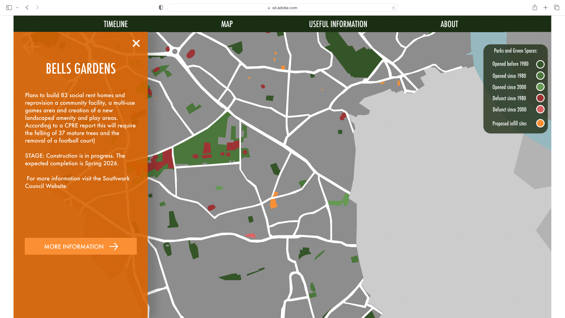
Aside from looking at parks and open spaces I was also interested in documenting some examples of infill sites. The yellow areas on the map depict infill sites. When they are clicked on the tab shows details of the site including how many new houses are being built and what stage the development is at.
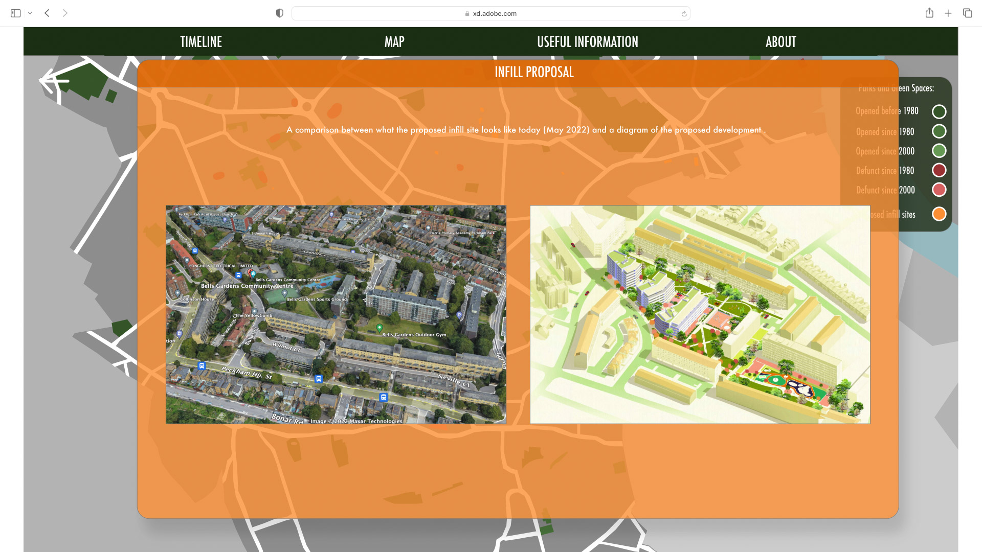
When the “More Information” button is clicked an overlay pops up depicting comparisons between what the original site looked like and what it will look like after the new development is built.
London Parkive V2
For my final year of uni I have the opportunity to write my own brief and work on that for the whole year! So in November 2023 I embarked on the mission of furthering the London Parkive. The key goals for Parkive V2, in relation to V1 has been to:
- Turn the idea of the London Parkive into an actual functioning website.
- Do more comprehensive research and data collection on parks and open spaces.
- Expand the search radius further to include more areas of London ( I have decided no to pursue this so I can spend more time refining the functionality of the website).
Researching London's Parks and Open Spaces
The research methods for collecting data have been improved a lot since Parkive V1! For Parkive V1 there were two main historic lists of parks that I used, one from the 1980s and one from 2000. For Parkive V2 I have been using five historical lists, ones from 1905, 1924, 1980, 1985 and 1999. This means a much broader scope for finding parks that no longer exist anymore. Especially when you factor in the parks that were made or destroyed as a result of WWII.
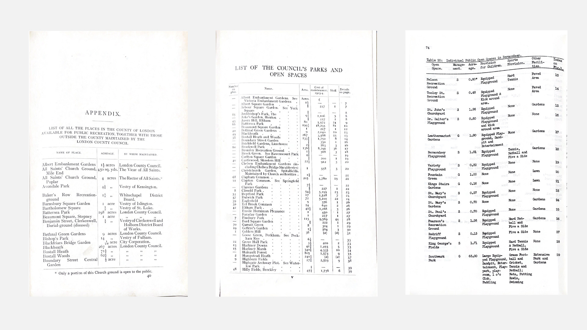
Photos of some of the lists I have been using to determine parks that no longer exist anymore. [From Left to Right: ‘The Municipal Parks, Gardens and Open Spaces of London’ (1905), London Parks and Open Spaces (1924), Recreation in Southwark (1980).
I have also been using National Library of Scotland’s (NLS) digitised old maps to work out where parks that no longer exist anymore were located and also to work out if a park has been expanded or shrunk over time.

Screenshot from National Library of Scotland’s website depicting a side by side comparison of Nursery Row Park. The map on the left is an old Ordnance Survey map dating from 1951 while the map on the right is a current map.
The NLS’s APIs (Application Programming Interface) has also made it easy to draw geoJSON (Geographical JavaScript Object Notation) so that these shapes can be easily added to the London Parkive website which has lead to the creation of a ‘Alterations’ view mode on the website that shows the evolution of the shapes and sizes of parks and open spaces within London.
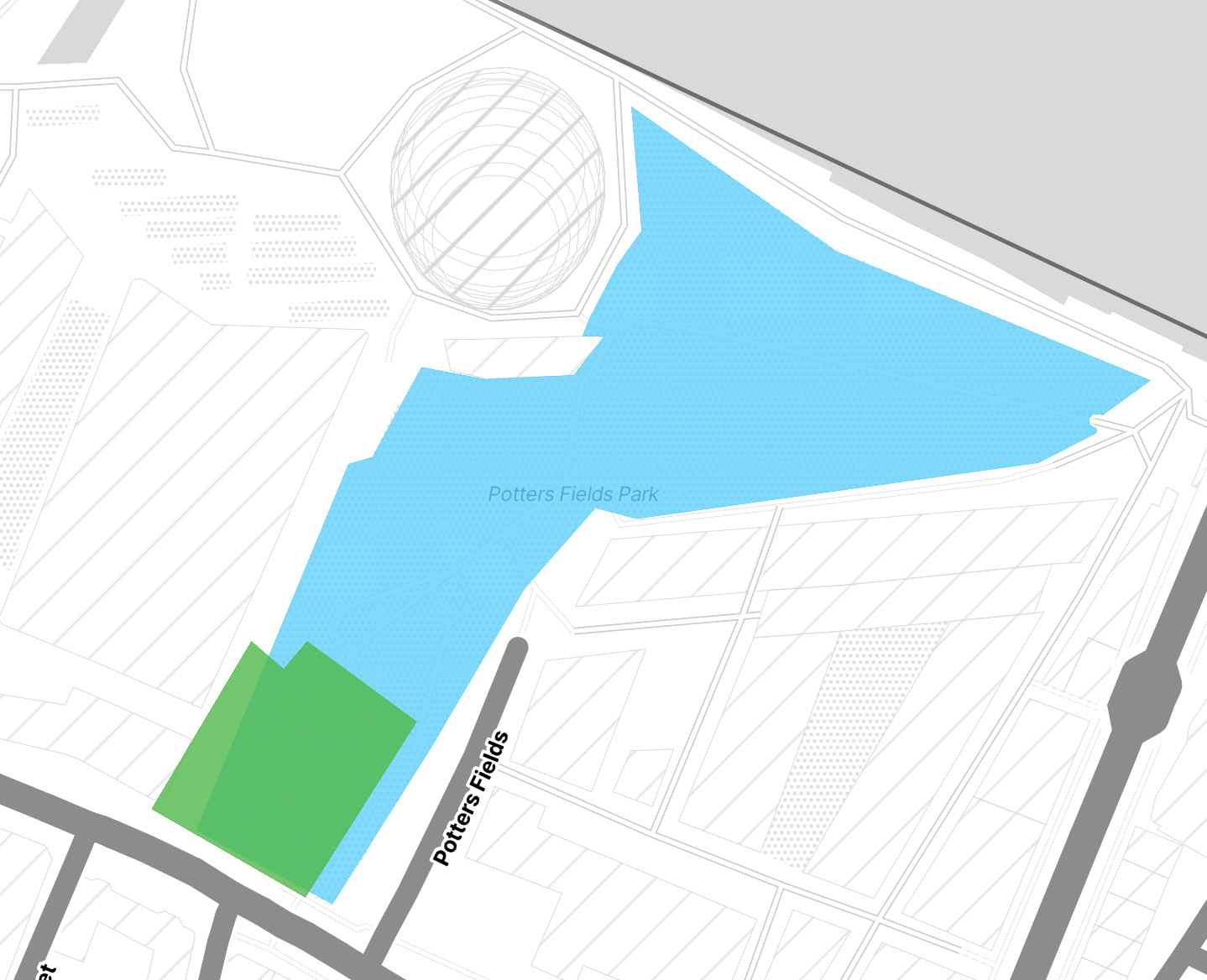
This screenshot depicts Potters Field Park, which since it first opened has been expanded. The green area shows the original park area and the blue shows where the boundaries have been expanded to.
Data Collection and Management
The information of the parks and open spaces I have collected has been added and organised on a Notion Spreadsheet. Information includes the geographical coordinates of the park, when it was opened, if the parks shape has changed overtime, and a brief history of the park. This spreadsheet has been converted to CSV and then to JSON format to add the website.
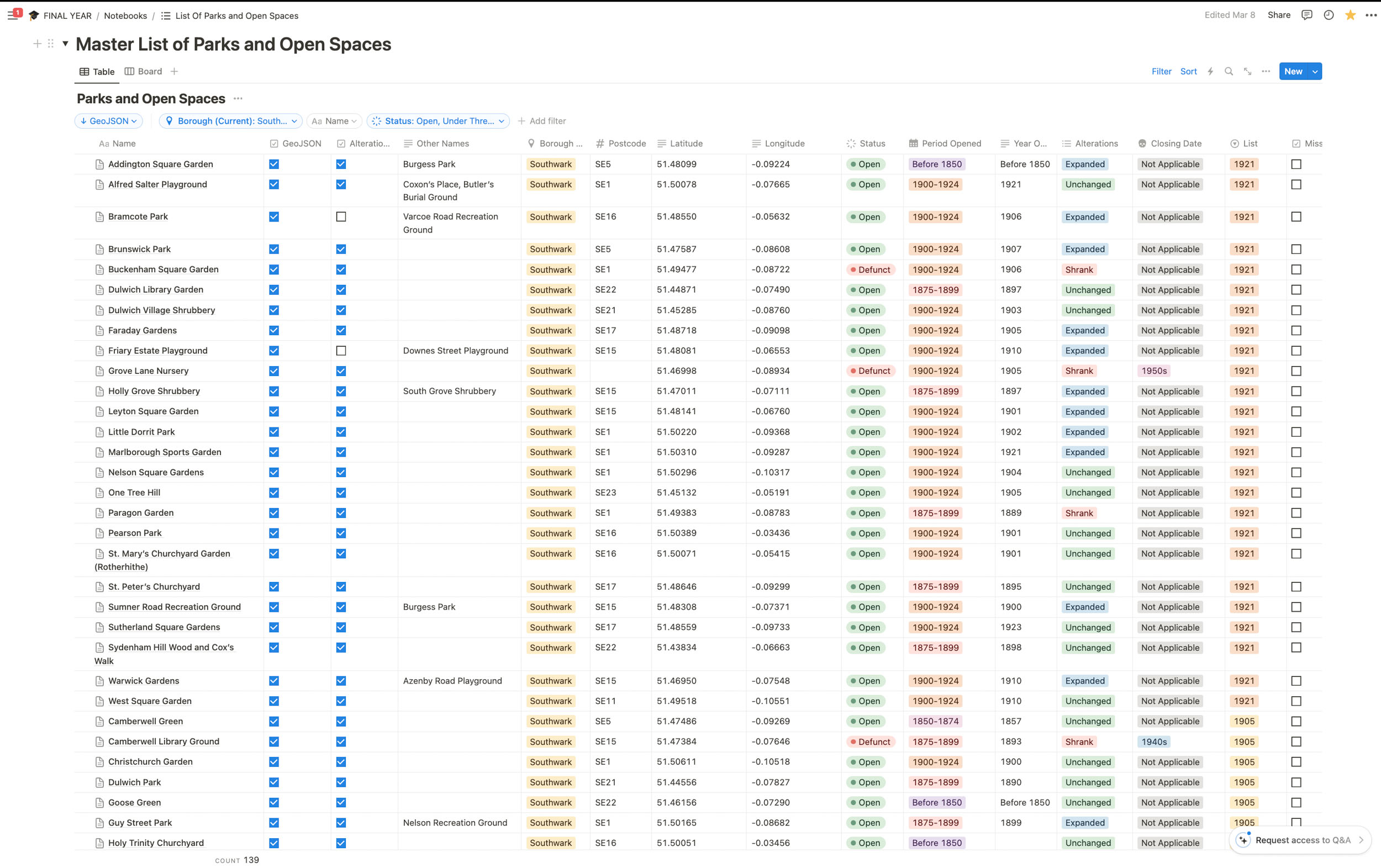
Screenshot of the master spreadsheet of parks and open spaces on Notion.
I have designed a high fidelity prototype of a form on Figma that could help streamline this process by allowing an administrative user to add park information through a form which will store the data directly into JSON format so this is a feature that may be implemented in the future.

A form I have designed using Figma which could help streamline the process of adding park data. If this form was built it could be directly linked to a JSON file.
Design
The London Parkive has a simple aesthetic. In truth, the designs were originally just meant to be the wireframes design which were intentionally kept simple as I was still learning how to code the website as I was building it and therefore didn’t want to be distracted by a complex design aesthetics. However, the simple designs make it accessible and easy to navigate and as I spoke with various people who had used the website it became clear that people actually liked the minimal aesthetic so I decided to stick with it. I initially intended to create high fidelity prototypes of the Parkive, in part because I wanted to practise using Figma and get better at using it. However I soon found that, I wanted to spend more time on actually coding the components, rather than prototyping them. Because I am the only person working on the project it didn’t make sense to spend loads of time prototyping something to just build it again using code so instead I made static wireframes and spent more time coding the components instead.

Screenshot of the basic wireframes I have made using Figma.
The aesthetics is currently purposefully limited to a black and white colour palette with thick borders to mimic the feeling of a sketch or plan. As someone who isn’t experienced in programming I have found it easier to keep the designs minimal while I build the functionality.
However several people have said that they like the blocky, minimal aesthetic of the page because it is clear and easy to use and read so I might stick to a similar aesthetic in the end.
Base Map
For the basemap of the Parkive I have chosen to use Stamen’s Toner Lite map. This is because the monochrome colour palette makes the data overlays pop and stand out more. As data visualization is a key element of this project I didn’t want the basemap to detract from the data being depicted.
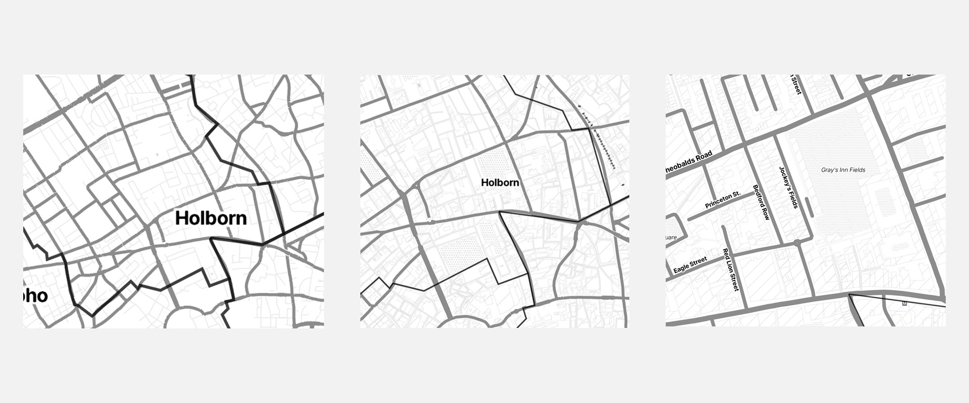
Stamens Toner Lite map at three different zoom levels.
Font Choices and Colour Pallets
There is one font used on the whole website which is Open Sans, a Google Font. This font was chosen because it is clean and easy to read and with it being a Google Font makes it accessible and easy to implement. It is also aesthetically close to the Stamens base map used on the website which makes the overall aesthetic of the website feel more seamless.
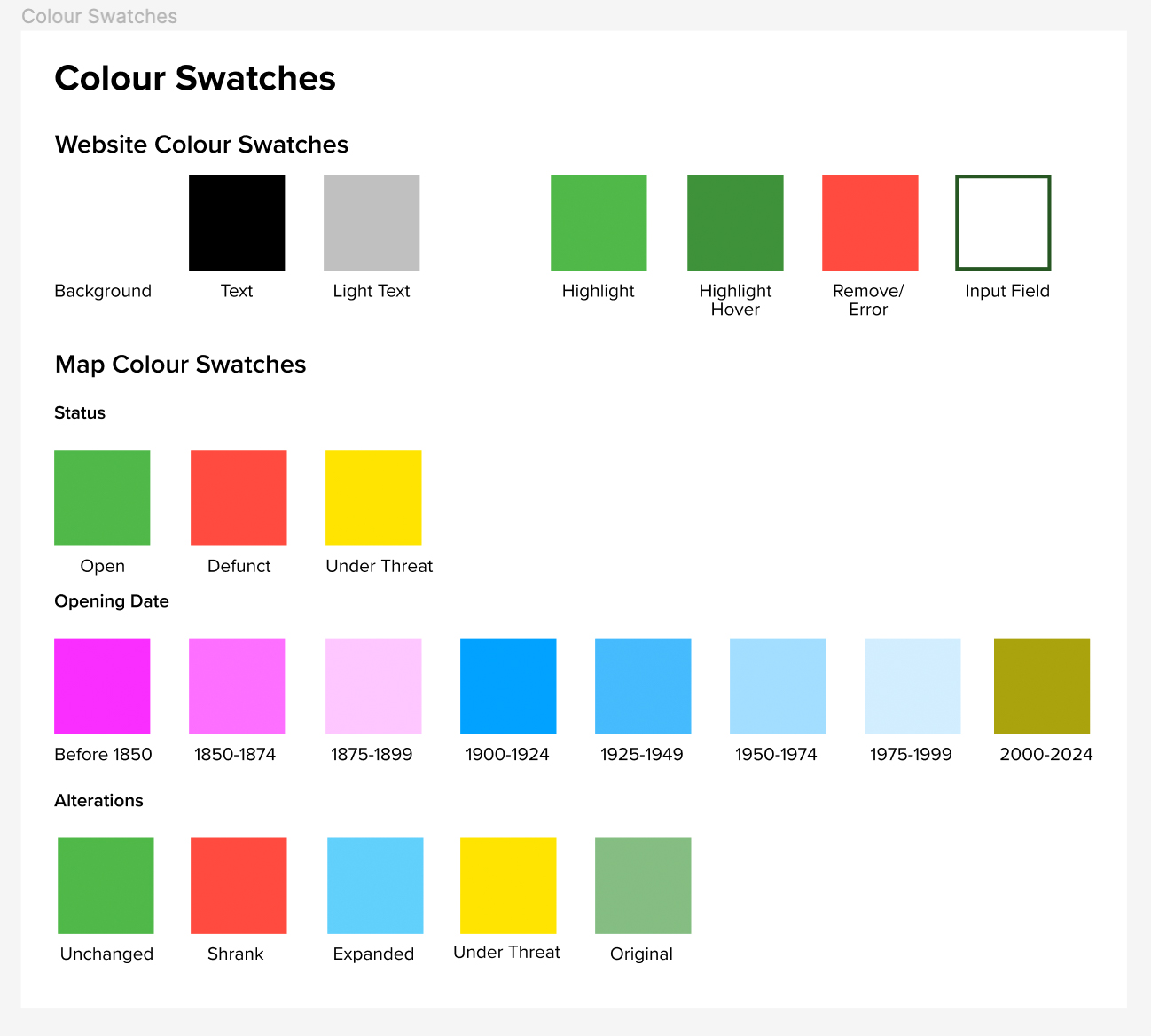
The websites colour palette on Figma.
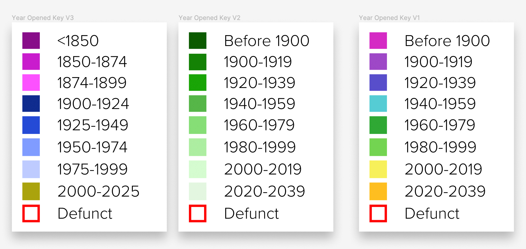
While the colour palette is mostly monochrome a lot of thought was put into the colour palette of the map keys. Especially for the ‘Year Opened’ view mode. I considered assigning random colours to the 8 keys in this view mode or using different opacity levels of one colour. However, the former felt too random and the latter was difficult to distinguish on a map so instead I went for three different colours (pink, blue and yellow) to represent each century and a gradient of each colour for each 25 year period. The colours are easy enough to distinguish but have enough correlation that patterns can be picked out from the data.
Different colour pallets for the ‘Years Opened’ that I considered before settling for something similar to the left colour palette.
Development
As a fledgling developer this has been the most challenging and rewarding aspects of the project. Prior to this project my only proper development experience has been building this portfolio website. This project has taken me on an expedition through the lands of APIs, JavaScript Libraries, along the way I have learned about CSVs, JSON and geoJSON and how to program for GIS (Geographical Information Systems). I have really learned to appreciate the ‘open source’ nature of programming where you can rely on what others before you have made to make the process of building something easier. Just to put into context, at the start of the project I thought I would have to code most of the website using only vanilla javaScript but through using MapLibre a lot of the programming for the map interface has been simplified.
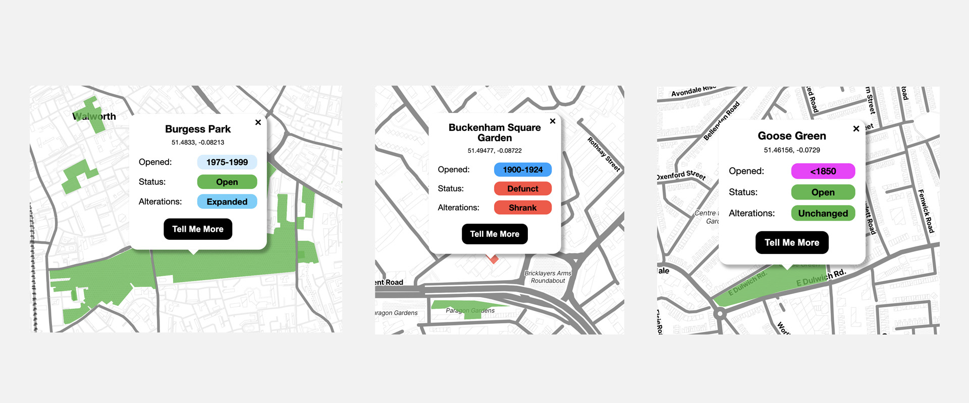
Examples of the dynamic popups.
This project has also been my first time using CSVs, JSON and geoJSON and it has really blown my mind how simple it is to store large quantities of data and call upon specific elements. I had no idea how any of this worked before embarking on this project. In particular, the ability to create dynamic elements such as popups whose information appears different depending on the value of the various parks properties.
Debugging was one of the biggest challenges and I had some help with debugging but as the project went on I got better at debugging, by using the developer tools on google and setting break points I got better at figuring out what went wrong where.
I also learned that with programming there are many ways to achieve the same outcome and that trying to simplify things doesn’t necessarily always make something easier. I learned this when making the table page’s dropdown menus. Having learned how to dynamically generate content I tried to do this with the contents of each dropdown menu only to discover that adding functionality to dynamically generated content was a bit too complicated for the level I am at given the timeframe I had. Having spent a couple of weeks on this already I deleted hundreds of lines of code and manually inputted the data which made it easier to add the functionality too and this only took a day to achieve.
If you are interested in reading the “Build Log” which I created, which goes into more detail on the build process as well as reflections and a couple of emotional tantrums along the way click here😜
The project is now over but my interest in programming is still there. In future project I would like to learn more about using frameworks, which is something that I didn’t use in this project, and learning how to write more efficient code.